Introduction to Data Analysis
This section only requires Practicus AI app and can work offline.
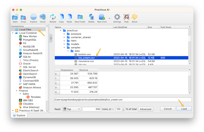
Working with local files
- Open Practicus AI app
- You will see the Explore tab, click on Local Files
- Navigate to the samples directory and open ice_cream.csv :
- home > practicus > samples > data > ice_cream.csv
- Click on the file and you will see a preview
- Click Load
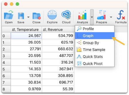
This simple dataset shows how much revenue an ice cream shop generates, based on the outside temperature (Celsius)
Visualizing Data
- Click on Analyze and select Graph
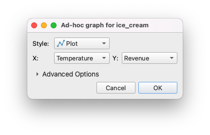
- Select Temperature for X axis and Revenue for Y, click ok
- You will see a new tab opens up and a graph is plotted
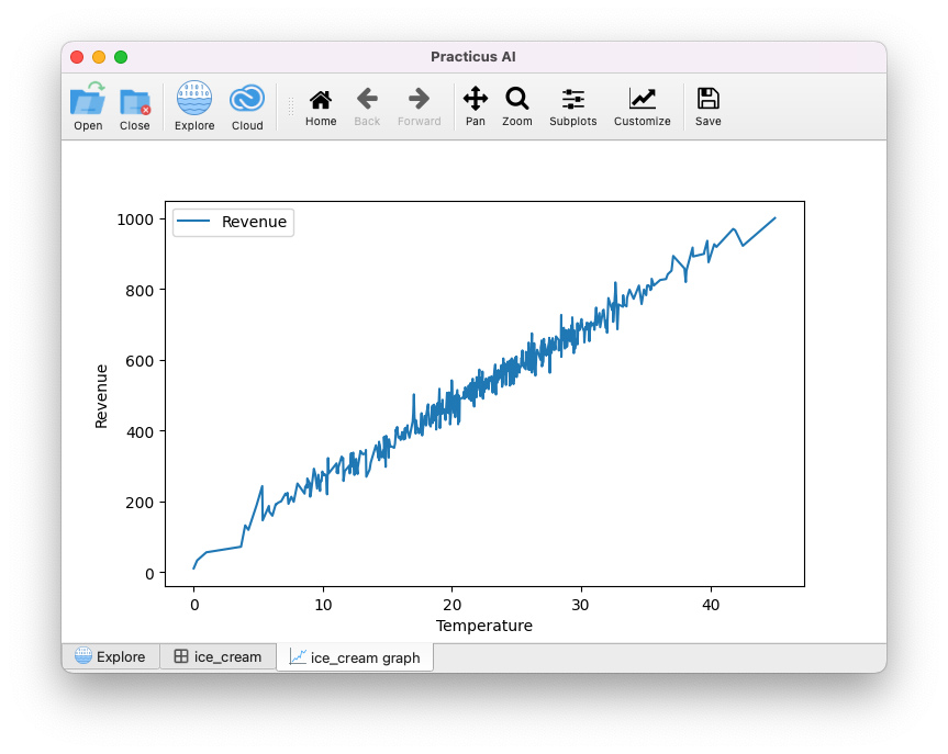
- Move your mouse over the blue line, and you will see the coordinates changing at the top right
- Click on zoom, move your mouse to any spot, left-click and hold to draw a rectangle. You will zoom into that area
- Click on Pan, left-click and hold a spot and move around
Now let's use a more exciting data set:
- Go back to the Explore tab and load the file below:
- home > practicus > samples > data > insurance.csv
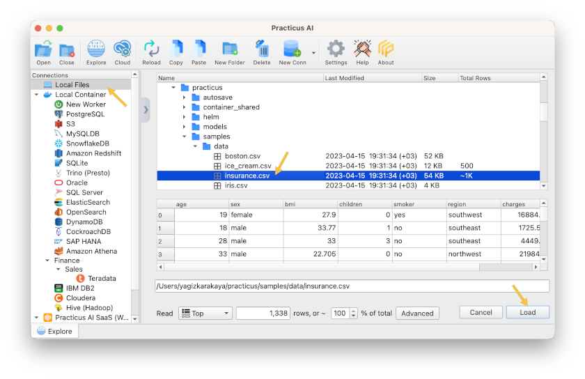
This dataset is about the insurance charges of U.S. individuals based on demographics such as, age, sex, bmi ..
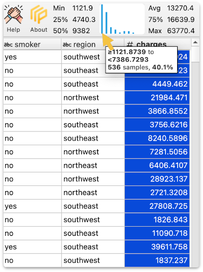
- Click on the charges column name to select it
- You see a mini-histogram on the upper right with basic quartile information
- Min, 25%, 50% (median), Avg (Average / mean), 75%, and Max
- Move your mouse over a distribution (shown as blue lines) on the histogram, and a small pop-up will show you the data range, how many samples are there, and the total percent of the samples in that distribution.
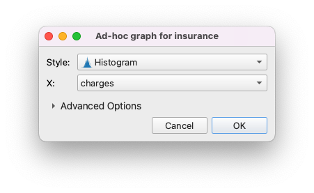
Now let's open a larger histogram for a closer look:
- Click on Analyze > Graph
- Select Histogram for style
- Select charges, click ok
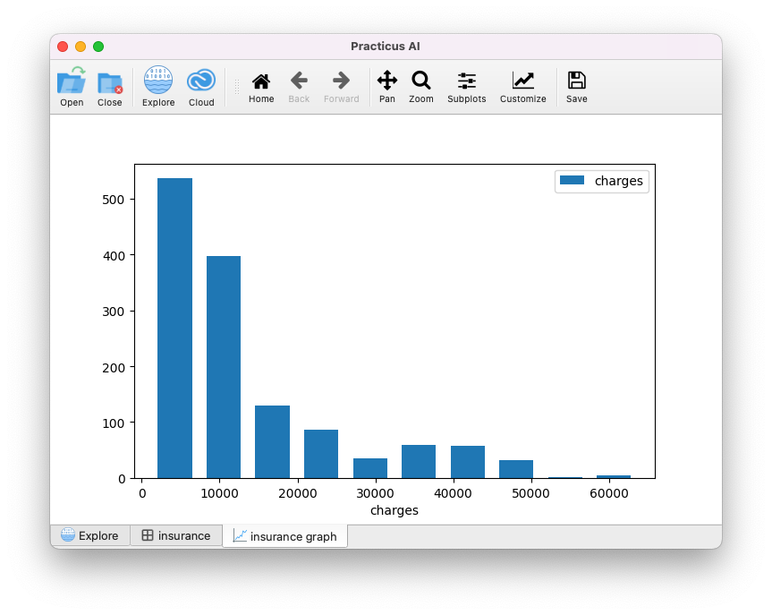
You will see the below histogram
Visualizing Outliers
Now let's analyze to see the outliers in our data set.
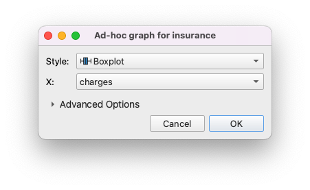
- Click Analyze > Graph
- Select boxplot style, charges and click ok
You will see the boxplot graph visualizing outliers.
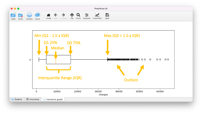
The above tells us that some individuals pay significantly more insurance charges compared to the rest. E.g. $60,000 which is more than 5x the median (50%).
Please note: Since Q1 - 1.5 x IQR is -$10,768, overall sample minimum $1,121 is used as boxplot min. This is common in skewed data.
Sometimes outliers are due to data errors, and we will see how to remove these in the next section. And sometimes we still remove them even if they are correct to improve AI model quality. We will also discuss this later.
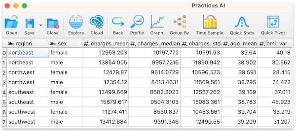
Group by to Summarize Data
Since our insurance data also has demographic information such as region, we can summarize (aggregate) based on how we wish to break down our data.
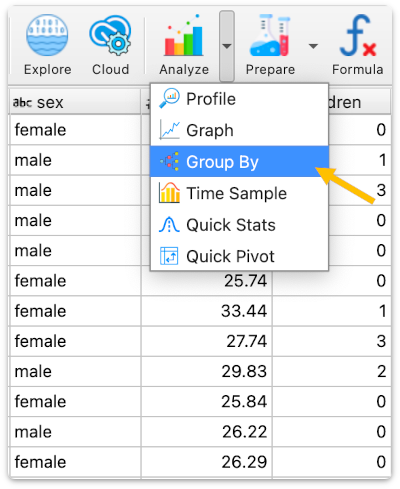
- Select Analyze > Group By
- Select region and then sex for the Group by section
- Select charges - Mean (Average), charges - Median (50%), charges - Std. Dev (Standard Deviation), age - Mean(Average), bmi - Variance for the summarize section
- Click ok
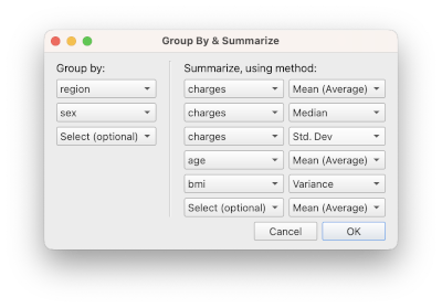
You will see the selected charges summaries for region and sex break-down. There is no limit, you can break down for as many columns as you need.
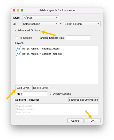
Now let's create a more advanced multi-layer graph:
- Select Analyze > Graph
- Click on Advanced Options
- Select region for X, charges_mean for Y
- Click Add Layer
- Select region for X, charges_median for Y
- Click Add Layer again
- Click ok
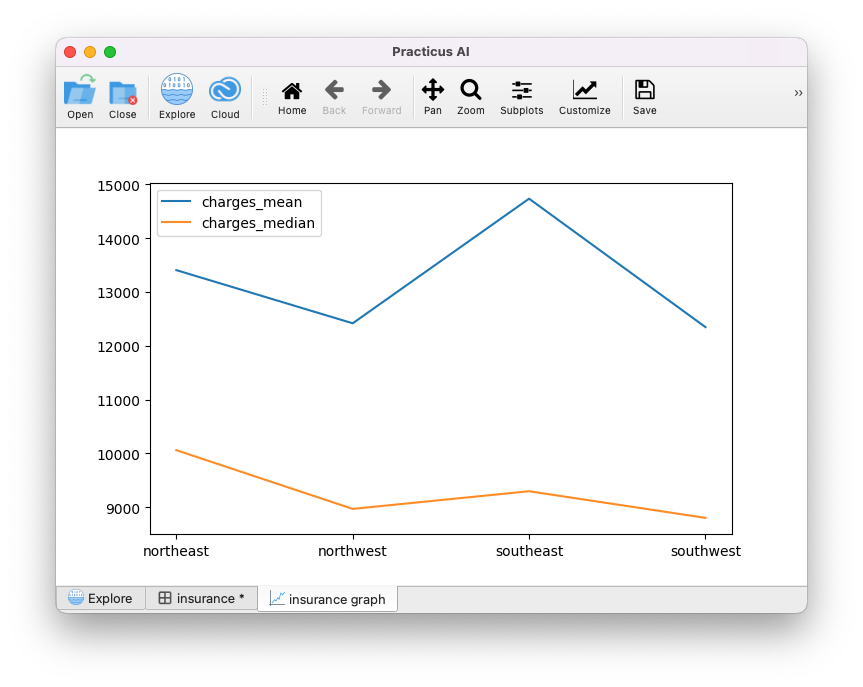
You will see the mean and median for different U.S. regions.
Let's say we want to email this graph to someone:
- Click on Save
- Select a file name. e.g. insurance.png
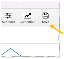
You will get a graphics file saved on your computer.